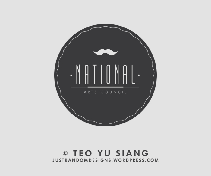
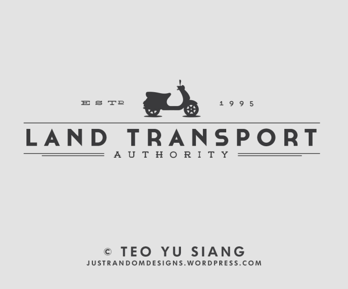
Quite a long time ago, I came across a website with hipster redesigns of popular brand logos, and since then I’ve always had the idea of redesigning the logos of Singapore statutory boards at the back of my mind.
So recently, given the abundance of time in my hands during the holidays, I decided to hipsterize the logos of some Singapore statutory boards. And here are the results:


Pingback: If Singapore stat boards had hipster logos… | 空谷幽兰 2.0
How about A*STAR? 😀
If I have enough time, I’d probably be doing another round of hipster logos!
This is real good. Hands down…. 🙂
Thanks! =D
man… I like these better than the originals
Haha thank you!
Reblogged this on Sublime Messes and commented:
Now I know I’m not the only one who thought we need a fresh new look to stat board logos. Makes me wanna deal with photoshop again. Haha.
This is really nice! SO PRETTAY.
Nicely done (:
Thanks! =D
Woots! justrandomdesigns made it to the #20 Blog of the Day in WordPress!! Thanks guys =D
Blogs of the Day: http://botd.wordpress.com/top-posts/?lang=en
HDB already has hipster X branding… http://statigr.am/p/622368953473642038_246575458
Pingback: Branding for the Bureaucracy | CJC Project Work
These are great! Especially the Land Transport Authority one. What fonts did you use, if you don’t mind me asking?
Thanks! For the LTA design, the fonts I used were Silverfake, Cassannet Bold and Weston.
Thank you very much for the response!
Again, great work. Very visually appealing
These are amazing. Love how clean they look. Can I ask what logo you used for the Maritime logo?
Thank you! I think you meant which fonts I used? I used Blanch, Weston and Futura in the Maritime logo.